13 Unique Illustrator Portfolio Examples & Tips for Yours
Find inspiration and build your own illustrator portfolio website today.
We collected the 13 best illustrator portfolios to inspire you. The selected professionals found special ways to showcase their stunning work. Learn from their example and use our pro tips to create your own portfolio.

Illustrator Portfolio Examples
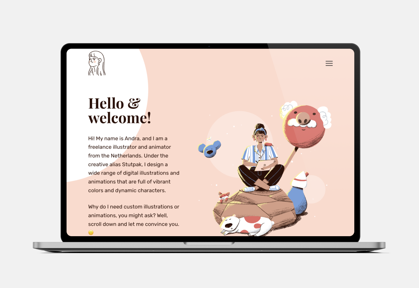
Look at that landing page! Stutpak’s portfolio utilizes UX to take the website’s visitors through a fascinating journey. She begins with a concise pitch and illustrates it with charming animations.
Scrolling further down, her contact information is easily accessible. Examples of her work are displayed below, featured as selected Instagram embeds with context. A straightforward about me page follows, with a repeated call to action and detailed contacts and socials.
A portfolio like this gives you limitless opportunities to build your personal brand.
Pro tip: opt for a portfolio builder that allows you to fully utilize the benefits of a professional website without coding skills.
2. Cinta Arribas
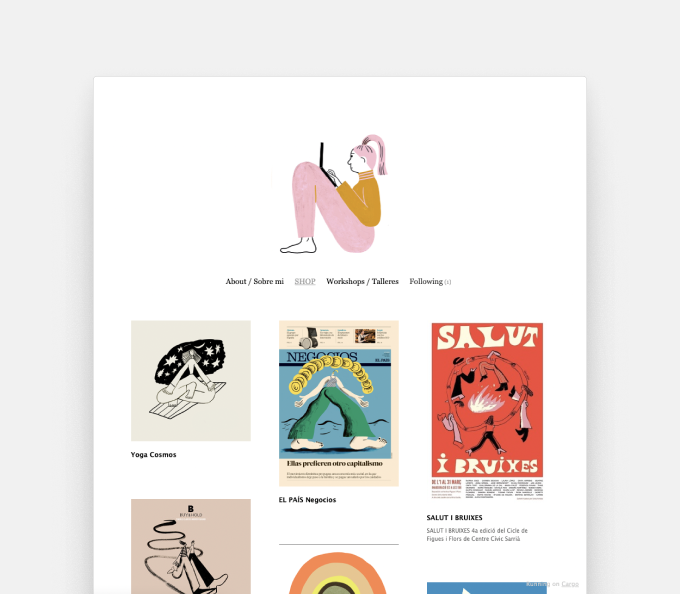
Cinta’s portfolio is more understated but not any less fascinating. The header with a self-portrait makes the website easy to remember. The accessible grid layout is stunning, with titles clearly displayed. Clicking on the thumbnails allows you to view more details about the artwork and learn their context: when were they made and for what purpose. The menus are in Spanish and English.
Pro tip: if you’re bilingual like Cinta, your portfolio has the potential to reach an even wider audience. Just make sure to provide translations to everything!
3. Nolan Pelletier
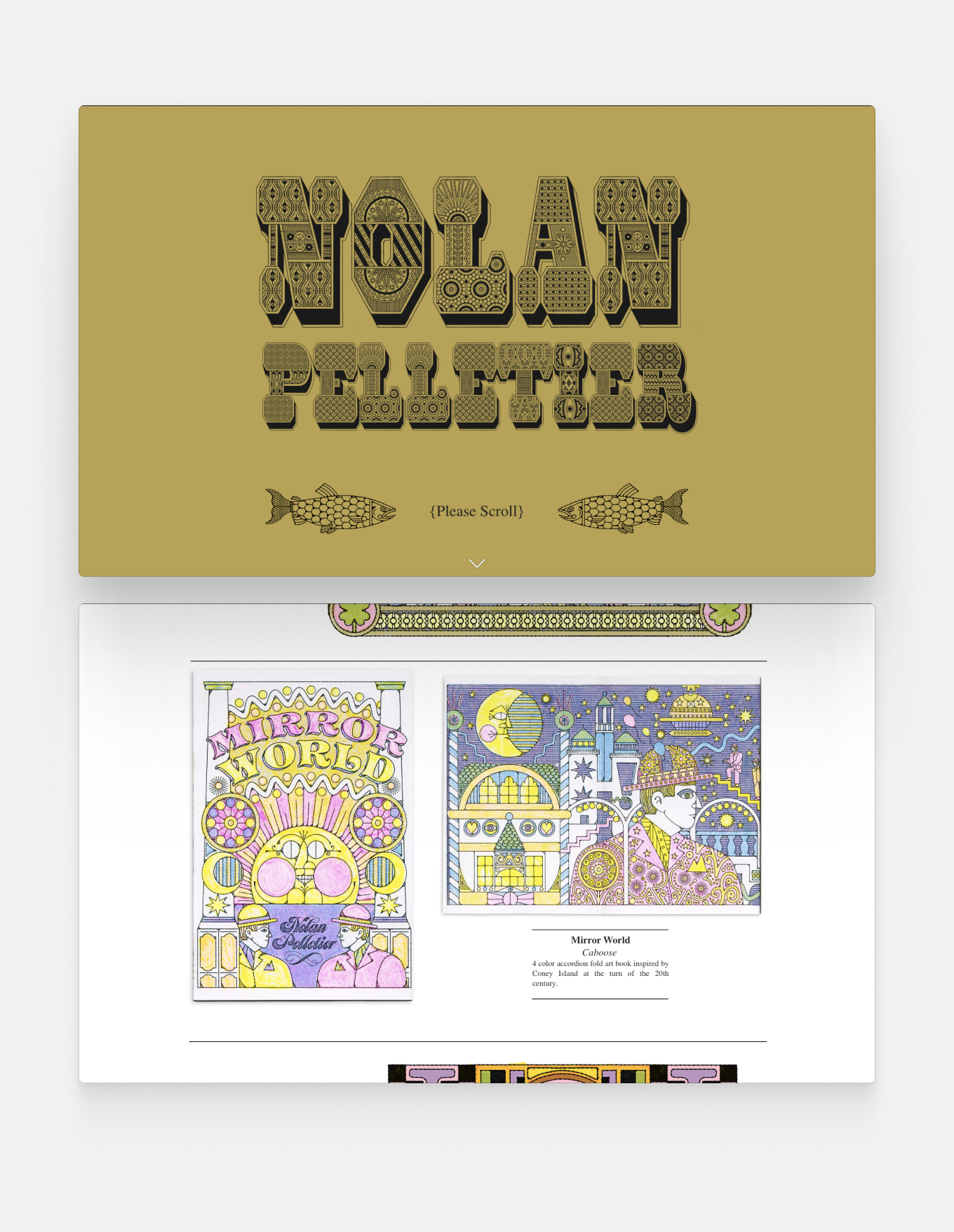
Nolan’s psychedelic portfolio embraces maximalism. He’s mixing bold images with mesmerising colours and patterns. The whimsical illustrations and photos are accompanied by precise descriptions. The only thing we’d improve would be highlighting the about me section and contact information, at the very bottom of the page. Endless scrolling has the disadvantage of impatient visitors leaving early.
Pro tip: there’s no need to reign in your imagination. Be bold and take up as much space as you like: it’s your portfolio, and it should reflect what makes you special.
4. Al Polston
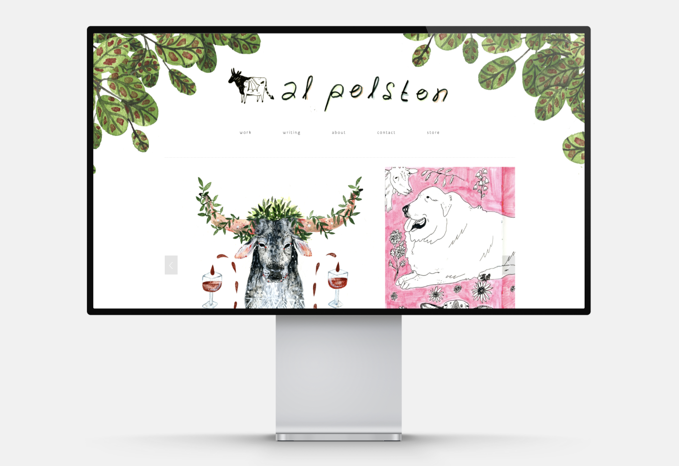
Al’s portfolio uses a carousel to display their illustrations, which makes the home page look organized and clean. The hand-drawn background and logo add a personal touch. The about me section is our favourite: besides the professional CV and list of accomplishments, you get to see Al’s studio and meet their dogs. You’re sure to be charmed enough to browse their webshop.

Pro tip: find your tone of voice. A friendly, laid-back portfolio can still be appropriate if it fits your artistic style and your ideal customers.
5. Loe Lee
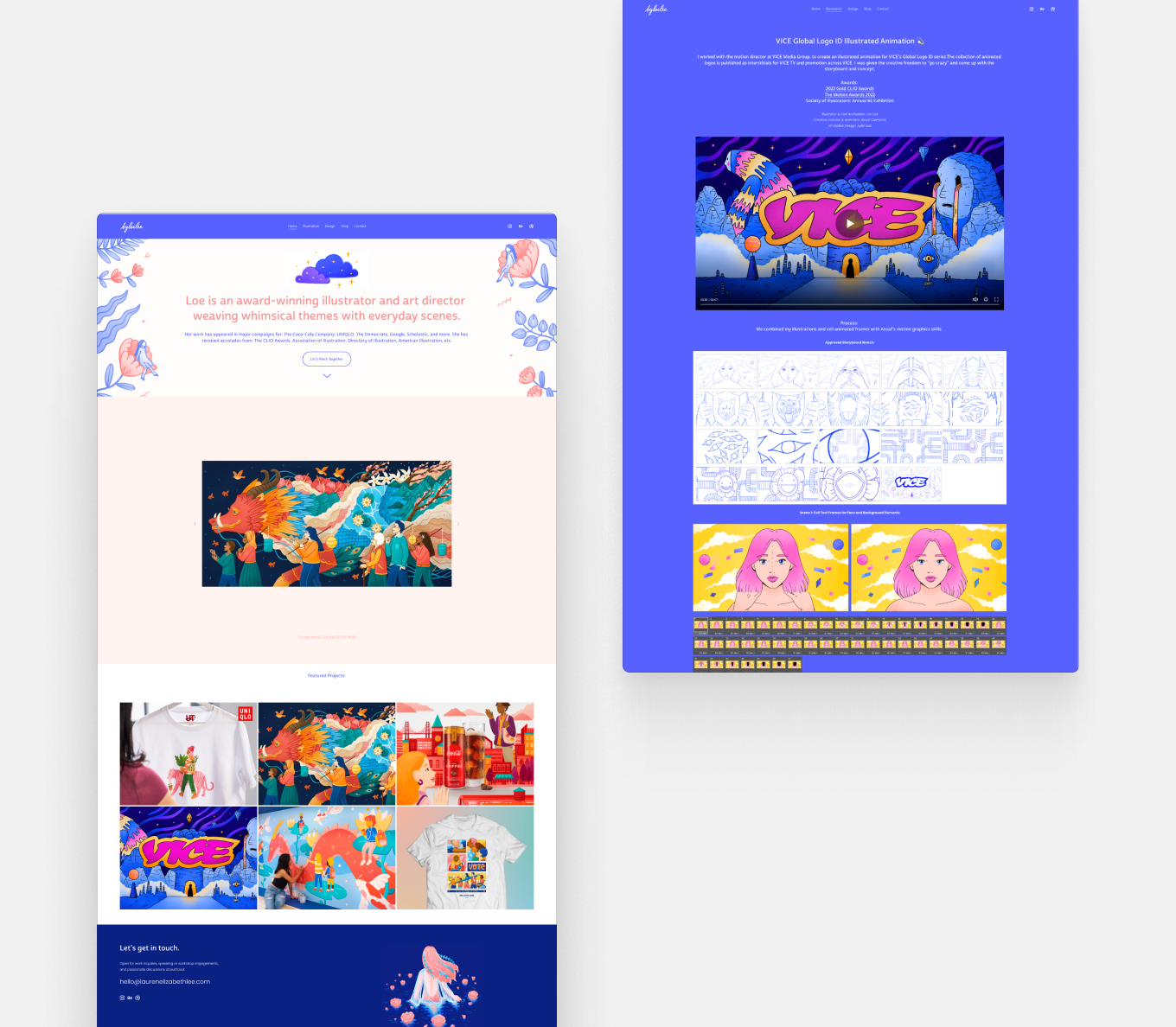
Loe Lee’s landing page shows us her work, the highlights of her career and a way to contact her–all in one place. Scrolling further down, we can see more of her professional client work and case studies, and learn more about her artistic process.
As an accomplished art director, her portfolio is polished and professional. Read more about art director portfolios here.
Pro tip: see that splash of color? There’s no rule that your template needs to be all white, as long as everything harmonizes.
6. Leeza Works
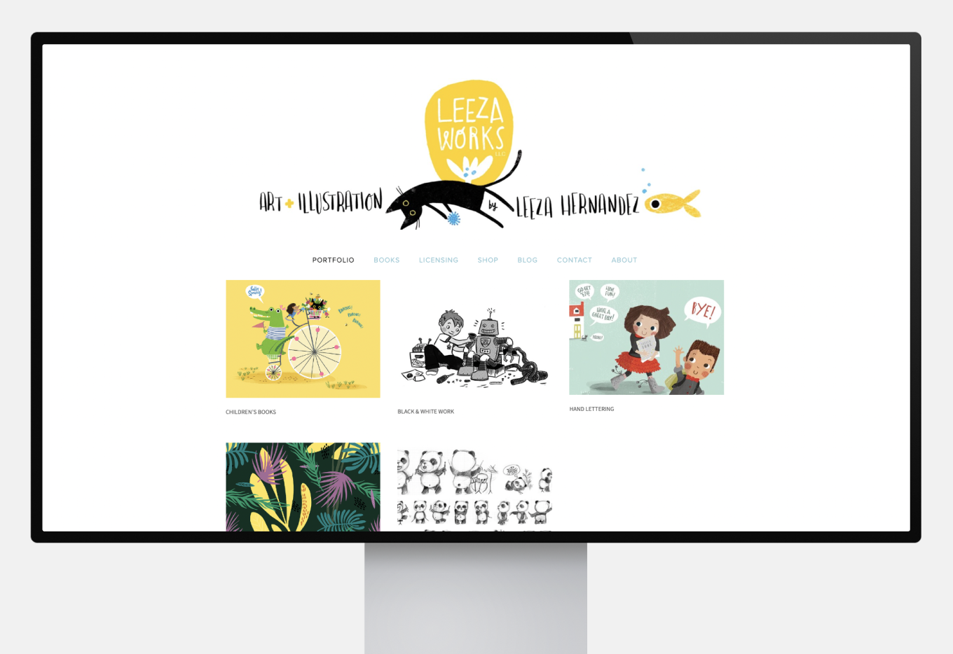
Leeza’s classic design utilizes a prominent header with a menu bar. The grid view portfolio is divided into categories, like children’s books or hand lettering. Some sections are password-protected for privacy.
Pro tip: password protection enables you to be mindful about confidentiality or protect your personal information. This is a great advantage of website-based portfolios, as opposed to social media.
7. Cherry Mo
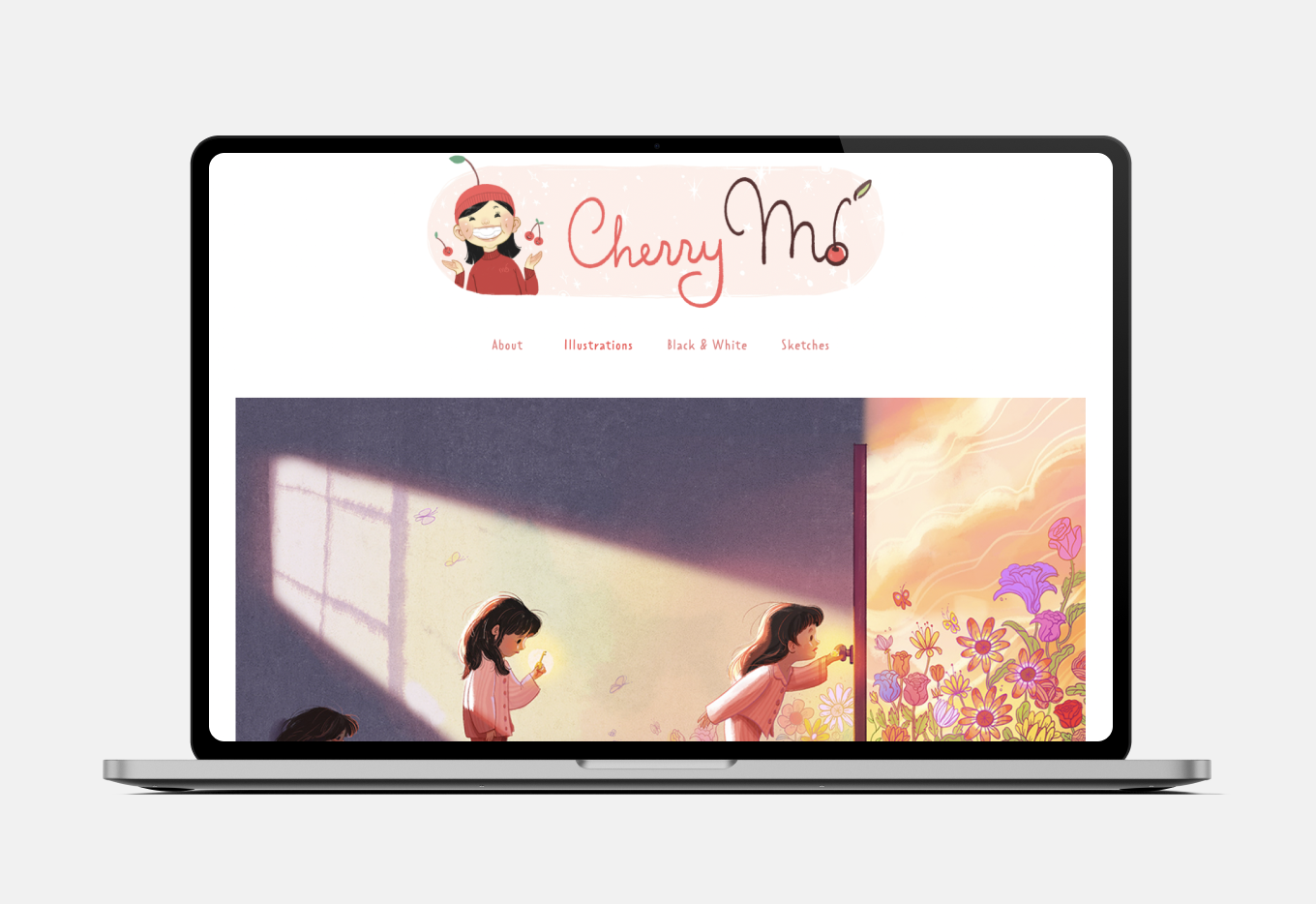
Cherry’s large scale display and pop-up descriptions highlight her artistic skills without being intrusive. The layout invites the viewer to get lost in her world. The well-written about me section guarantees that Cherry’s professional background and contact information are readily available.
Pro tip: besides your illustrations, the about me page is the most important part of your portfolio. Clients and recruiters want to know your background and experience level. Read our guide for a detailed how-to.

8. Heather Power’s Art
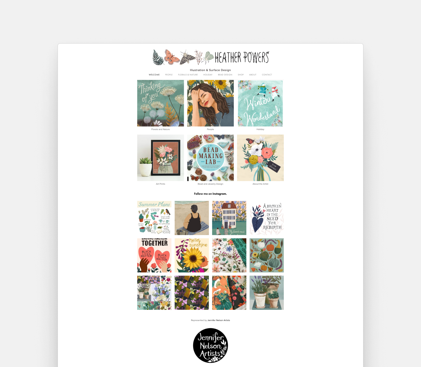
Heather’s portfolio has a unique approach to categories: she grouped her illustrations by themes, from flowers to holidays and people. This highlights her varied skills and interests. Her portfolio is like an enchanted castle with beautiful treasures behind every door.
Pro tip: group illustrations with similar subjects together to create cohesion and make an impression.
9. Julian Miholics
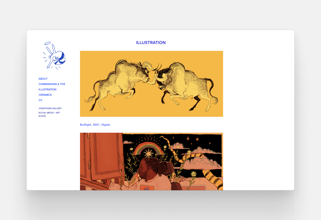
Julian’s hand-drawn mascot adds a charming personal touch. He uses a vibrant blue color for the text, making the simple design more memorable. The pictures are displayed in full, with titles and dates indicated.
Pro tip: the devil is in the details. A few small touches can be enough to make your portfolio stand out.
10. Ella Lama
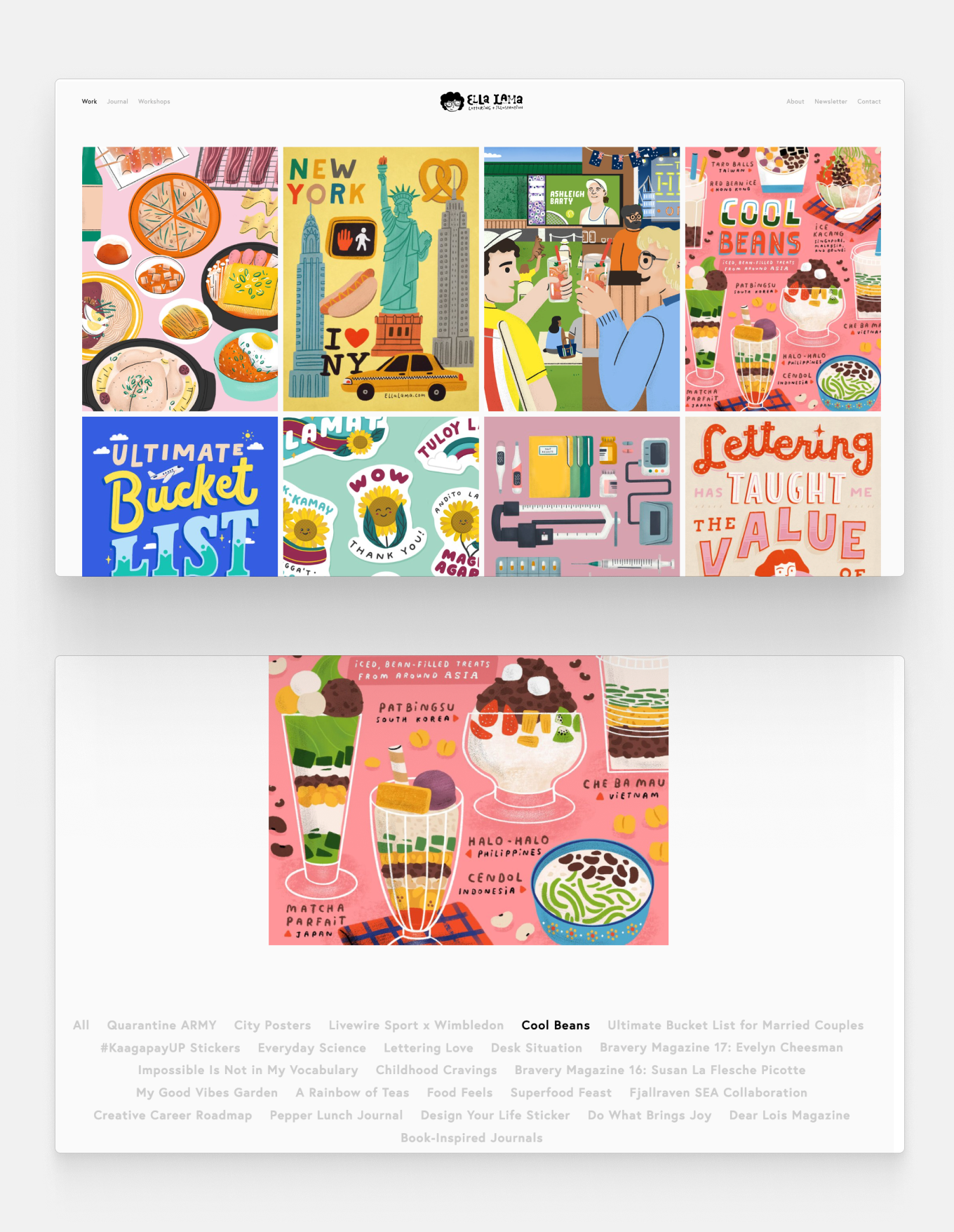
Ella’s bright and colorful portfolio has a very clever element: the cloud at the bottom makes it easy to navigate between her projects. She worked with more than 20 brands and magazines, so it’s a great way to help the viewer navigate her rich portfolio.
Pro tip: if you have a lot of illustrations to display, organization is key. You want your viewer to see everything, so make it easier for them to explore your site.
11. Cindy Salans Rosenheim
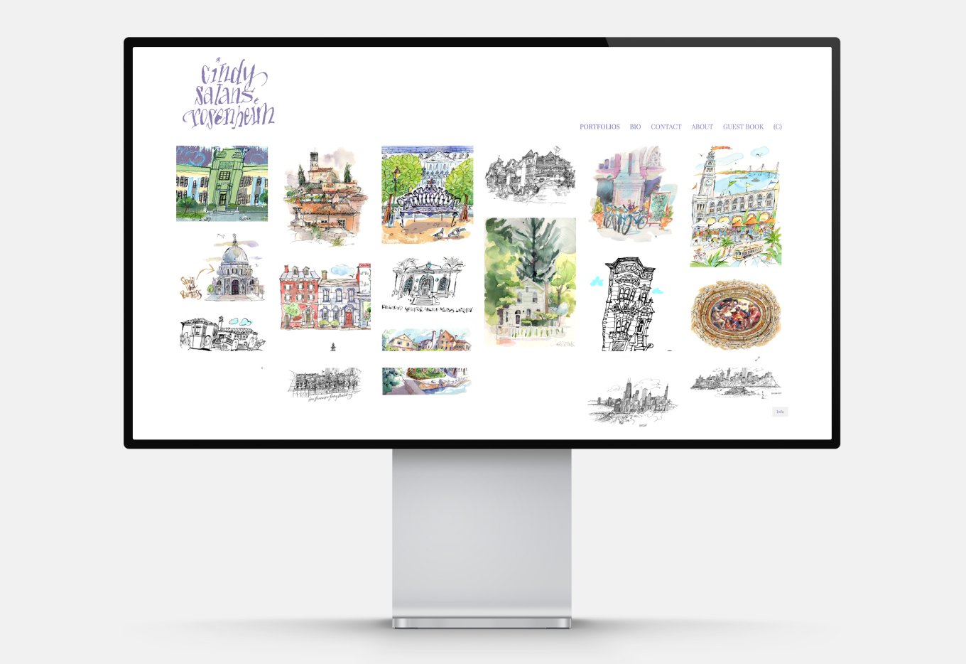
Cindy’s work is wonderfully varied, from architecture illustrations to fashion, maps and editorials. To keep it organized, she uses a drop-down menu for the categories. The lilac text and playful fonts fit the whimsical style of her illustrations.
Pro tip: show versatility by displaying varied projects. Maybe your best work is all portraits, but you might need to prove that you can also do hand lettering to land the job of your dreams.
12. Joana Dionisio
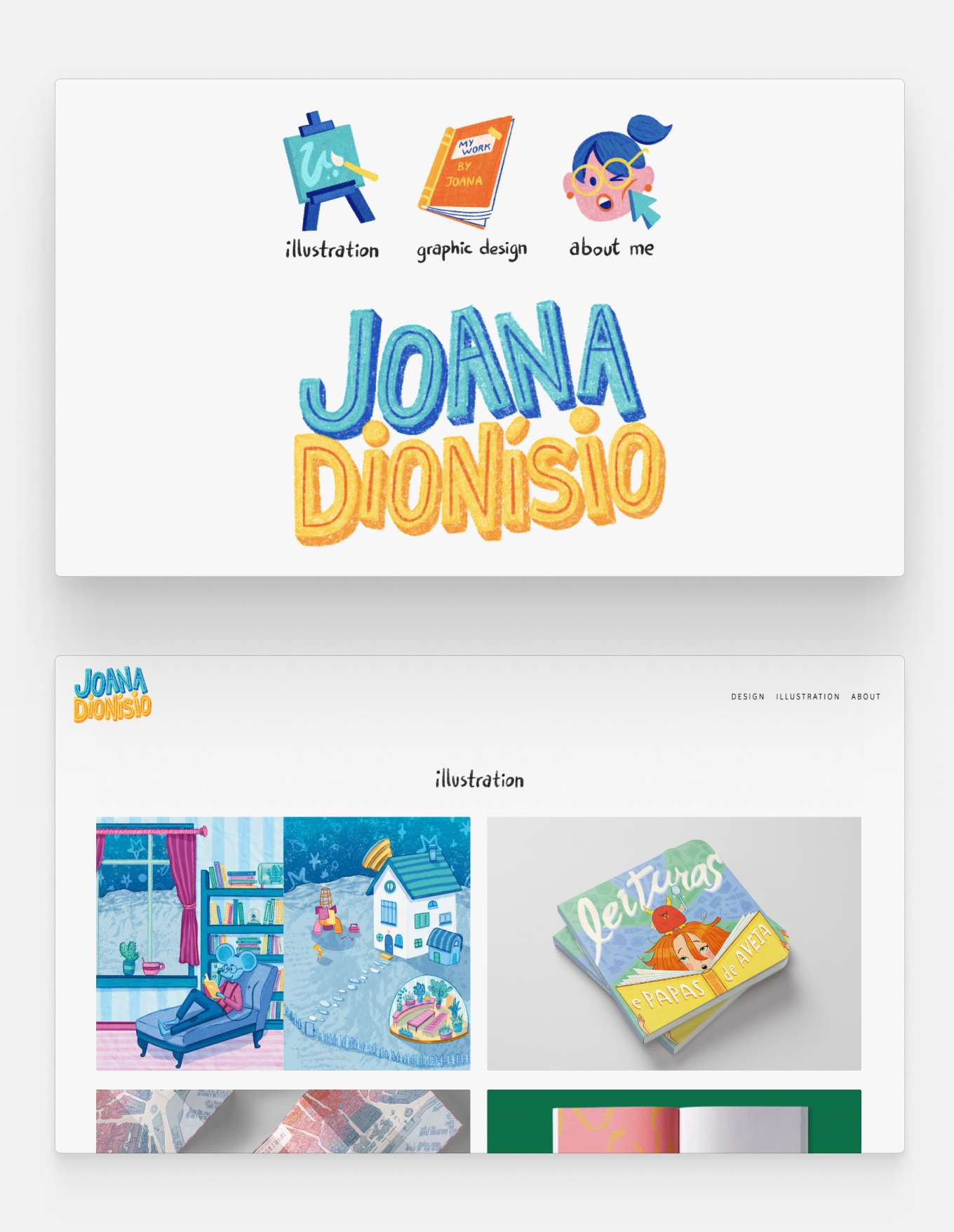
Joana’s joyful portfolio has animated menu icons with her name boldly displayed. This landing page is fairly simple, yet still catches the audience’s attention and communicates Joana’s energetic style.
Her portfolio showcases case studies, from children’s books to magazines, zines, and maps. If you also have graphic design experience, learn how to build a graphic design portfolio.
Pro tip: you don’t need paid projects to display case studies. Offering work to a zine or a non-profit, as well as illustrations made for competitions can prove to your audience that you can effectively work with guidelines and deadlines.
13. Eldrtchmn
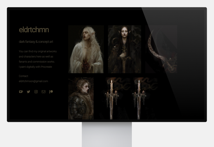
While most portfolios opt for a neutral white background to make sure the illustrations pop, Eldricht Moon’s portfolio is all black. This design choice embraces the color scheme of their dark fantasy concept art without compromising neutrality.
The images displayed all link to their Instagram profile so their audience can see more of their work and follow them. Learn the main differences between a portfolio website and social media and why sending an Instagram link to an employer or client is bad.
Pro tip: experiment with dark mode to stand out. Include your socials, but never rely on them for professional exposure.

What Does an Illustrator Do?
Illustrators are professional artists who create digital and/or analog images. They are typically freelancers or contract workers doing commissions, but in-house illustrators can work for agencies or firms.
Illustrators work in the following fields:
- Publishing, including books, newspapers, comics, graphic novels or other print media.
- Advertising, creating illustrations for campaigns and social media.
- Entertainment, including movies, series, video games, and other media.
- Design, in collaboration with graphic designers an art directors.
- Fashion, to translate the ideas of fashion designers.
- Education, from technical illustration to textbook illustration.
- Fine art, which gives illustrator an opportunity to exhibit and sell their prints.
The responsibilities of an illustrator:
- Understanding client needs
- Sketching preliminary concepts to iterate according to the client's need
- Finishing the illustration to convey a desired emotion, message or idea
- Being able to use various techniques, from traditional to digital
- Collaborating with art directors, graphic designers or marketers
- Keeping up-to-date with industry trends and developing their skills
- Managing their time to meet deadlines and effectively communicating with the client and their team
These skills need to be reflected in your portfolio.
What to Put in an Illustrator Portfolio
The 13 examples above prove how diverse and exciting illustrator portfolios can be. Here are the five things they all have in common:
1. Curated Works
Selecting which illustrations to include in your portfolio is the toughest part of the process. Our advice is to select the best of the best. Ten strong illustrations say more about your skills than twenty mediocre ones. The ability to curate is a vital skill. Seek feedback if you feel lost, and adjust your portfolio so it reflects the type of work you want to do.
2. Strong Copy
There’s no way around it: while great art speaks for itself, portfolios need context. You can include the title, date and medium of each artwork, for a start. For more detailed descriptions, think about the occasion and the inspiration behind them. When you send the link to an employer, always attach a cover letter.
3. Case Studies
Even if you’re a student or a junior, you can show your process by including drafts or a time-lapse video. You can also use prompts and participate in illustration contests!
4. About Me Section
Employers and clients want to know about your professional background. Don’t know what to include besides your education and work history? Think about what made you want to become an illustrator, or how would you describe your work. Find more tips about what to put in your bio here.
5. Contact Information
Make sure that your contact information is readily available in your portfolio. A great benefit of a portfolio website is that you can use an embedded email format, so people can reach you more conveniently.

Portfolio Website vs. Social Media
You probably already have a home for your illustrations, but they also need an office. While platforms like Instagram or Art Station earned their popularity, it’s worth considering the five reasons why having your own illustrator portfolio website is the smartest choice.
1. You Will Get Ahead of the Competition
Social media is a great place to connect with your fellow artists. However, it can be a disadvantage if you’re looking for employment or clients. Linking your social media handle or art station profile will distract your viewers, and the algorithm will lead them to your competition. If you use social platforms for your portfolio, you’re giving exposure to illustrators who may steal your spotlight with better statistics and a higher follower count. This is why having your own portfolio website is a major advantage.
2. You Will Look More Professional
Some hiring managers will outright dismiss social media links submitted instead of a portfolio. You may never know why they said no to your application, as it’s often an unspoken rule. Linking a portfolio website with your own domain proves that you’re willing to invest time and effort into your professional reputation.
3. You Will Be in Charge
Social media platforms change and adapt to a complex global market. Illustrators can become jeopardized with each update, for example, if Twitter decides to crop your images or Instagram’s algorithm starts favoring videos. When you have your own website, you don’t have to worry that somebody will change the rules of the game overnight.

4. You Don’t Have to Compromise Quality
Most social media platforms will make you compromise on image resolution. While the quality loss is less drastic on some platforms than on others, showing your rendering skills is crucial when it comes to employment or getting a new client. A portfolio website allows you to display your work in high resolution.
5. You Can Make a Lasting Impression
Social media profiles have a unified layout. After a while, they all blend together. On the other hand, a portfolio website gives you a great opportunity to create a memorable personal brand.

Stay inspired and get hired. Subscribe to our newsletter so you will never miss our latest career tips!
