17 Stunning Graphic Design Portfolios & a Guide to Create Yours
From student to senior: a definitive guide to building your portfolio.
Learn how to stand out and create a graphic design portfolio that tells your story. Scroll through our ultimate guide with beautiful examples and straightforward tips. Whether you’re a student, beginner or senior, we’re here to help you build your portfolio in no time at all.
CONTENTS

Graphic Design Portfolio Examples
1. Iman Naser
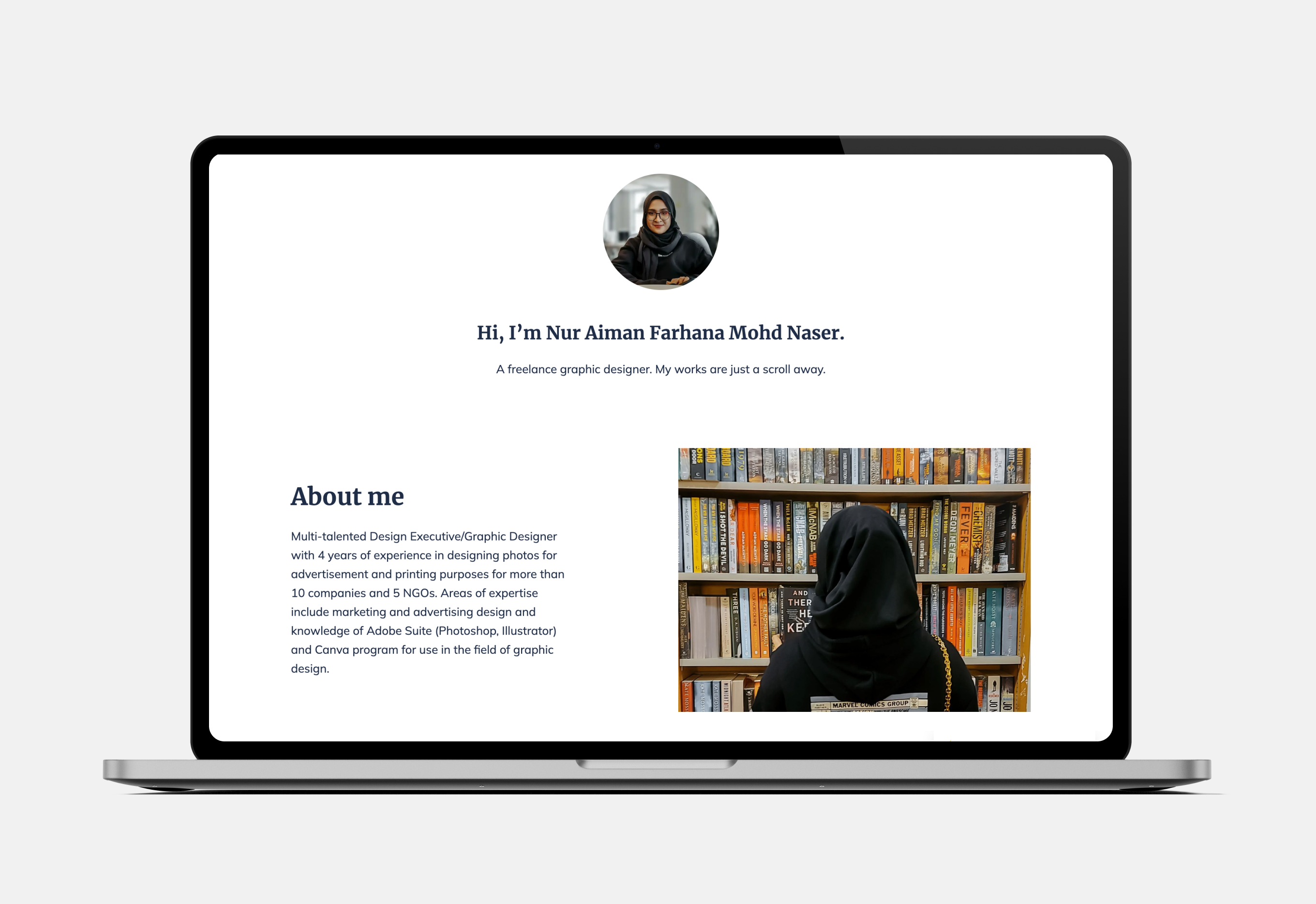
This sophisticated portfolio is perfect for marketing and advertising designs. The subtle layout lets the vast array of designs shine, which are organized according to theme and color scheme.
Pro tip: this elegant portfolio took less than 30 minutes to build. A dedicated portfolio builder website like Copyfolio lets you display your work with no coding skills.
2. Forensics & Flowers
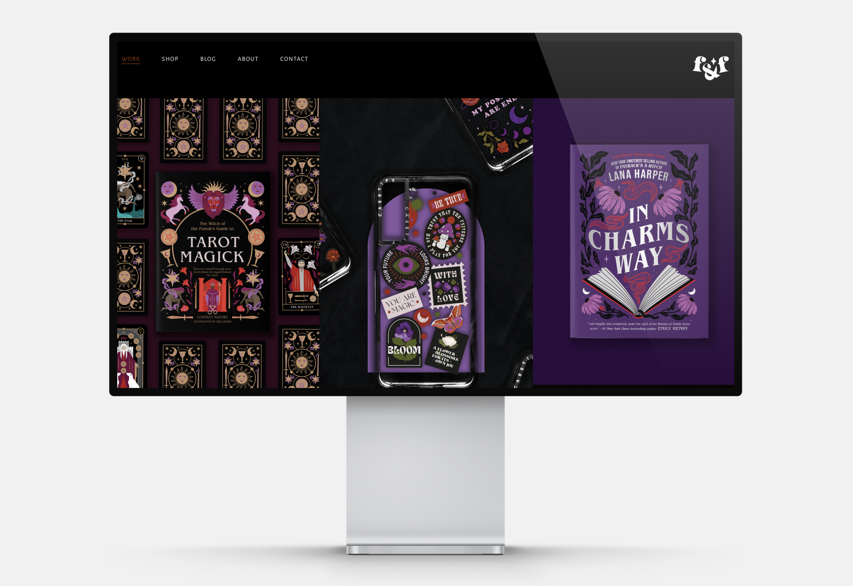
Mockups are magic. This portfolio allows a glimpse into a dark and dazzling world. The featured designs include book covers, phone cases, mugs and logo design.
Pro tip: use mockups so your clients can see your design in action. Display the mockup on a well-designed poster for the maximum wow-effect.
3. David Milan
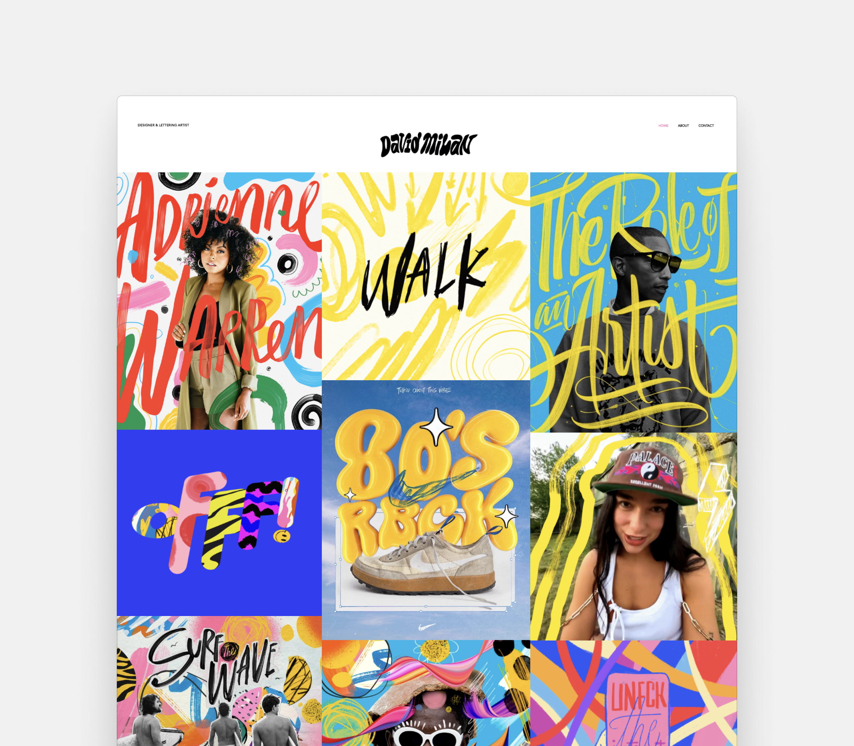
A riot of color with fun animations: David’s portfolio is bold and beautiful. Images are fitted together in a tile view, revealing more detail as you click on them.
Pro tip: if you have a massive selection to display, cohesion is key. Arrange the images so they rhyme according to color, theme or technique.
4. Erik Marinkovich
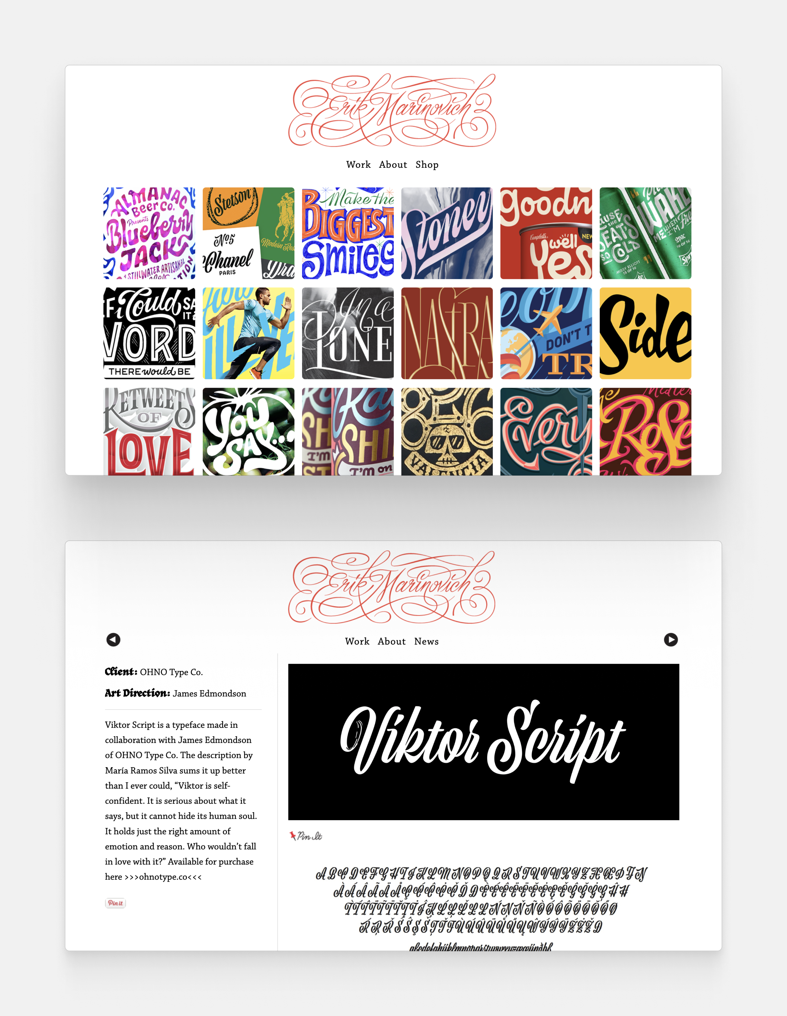
Erik specializes in lettering. By using a classic grid view layout, he can showcase an abundant sample of his work without visually overwhelming the onlooker.
Pro tip: your calligraphy work may be tough to challenge, because words tend to be distracting. Smaller thumbnails like Erik’s allow your viewer to take in your work without diversions.
5. Aries Moross
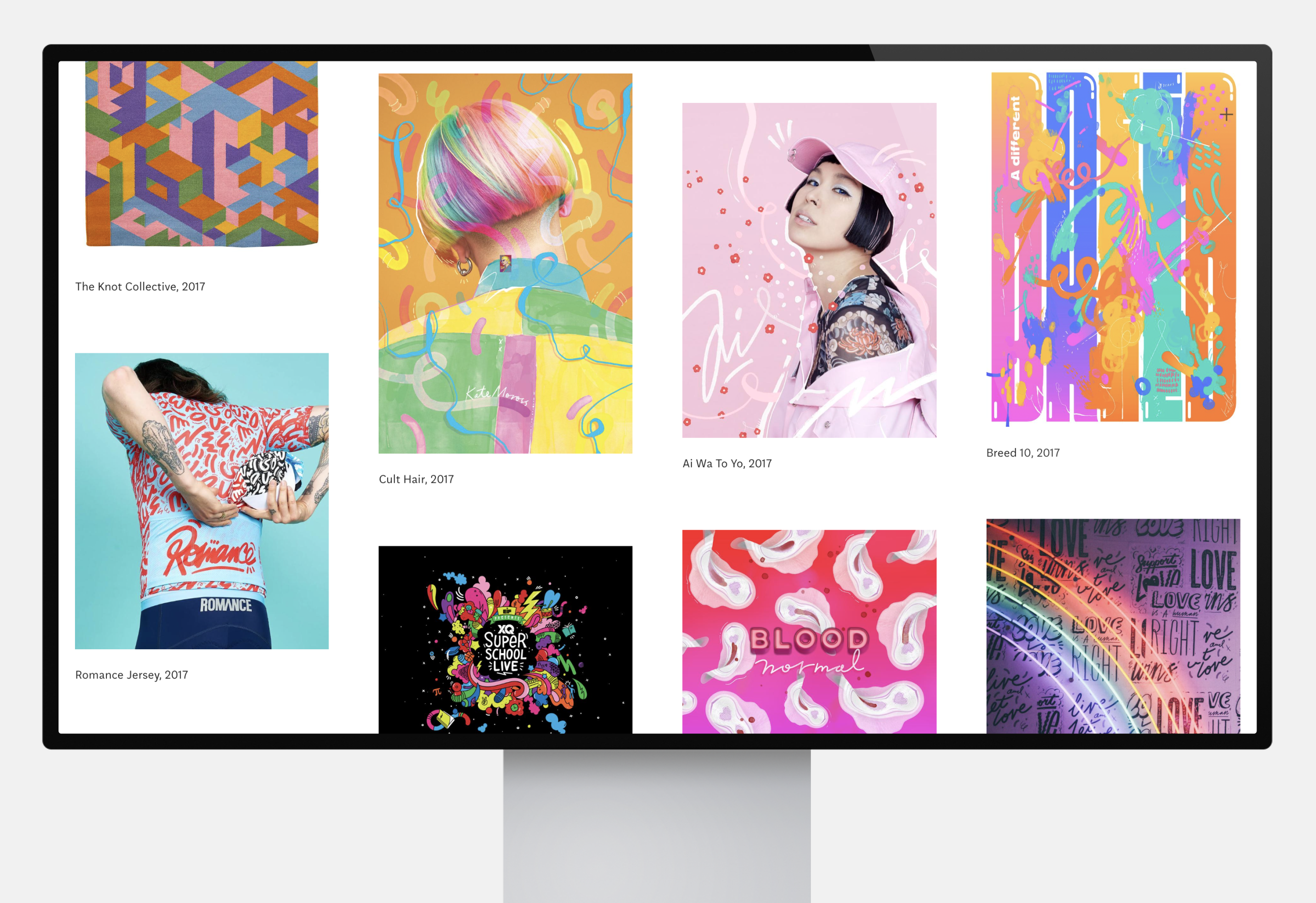
Aries has a lot of outstanding projects to show. They collaborate with big brands and design everything from packaging to products, logos, apparel and magazines. The careful labeling and the white space lets the portfolio breathe.
Pro tip: you don’t need to overthink your layout. Sometimes less is more.

6. June Digan
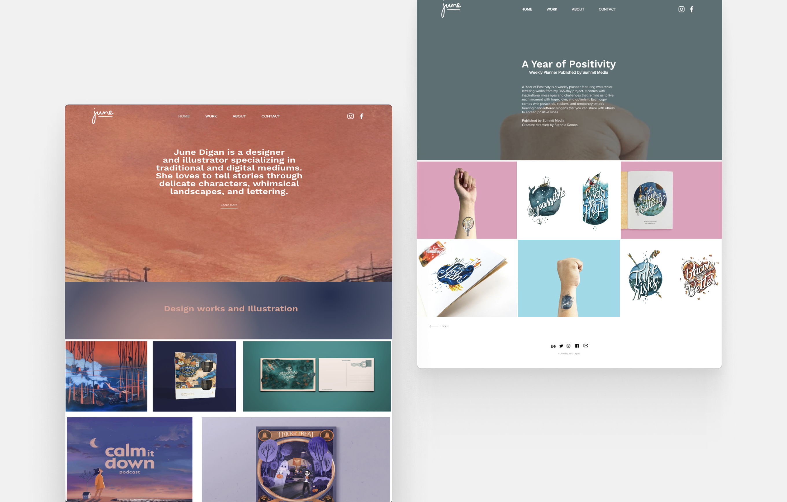
June’s full-size header image and moving thumbnails let her take full advantage of the website format so she can show her designs and illustrations in their full glory. All projects have several photos in their subpage to let viewers explore each detail.
Pro tip: if you lean more towards illustration than design, check out our guide to illustrator portfolios.
7. Chelsea Cardinal
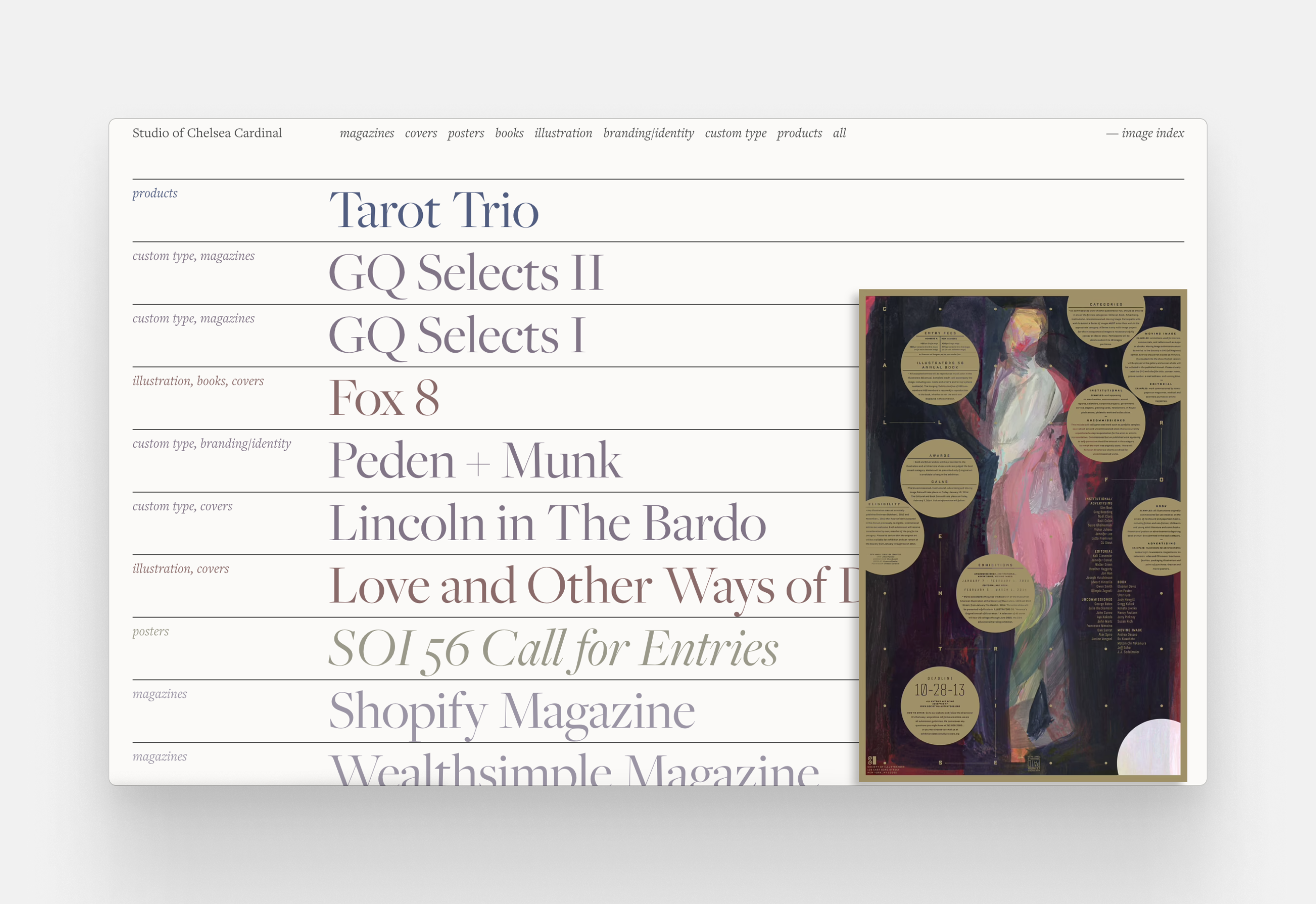
Chelsea’s text-centric portfolio neatly organizes decades worth of work. Her playful approach to spacing, size and color creates an impactful layout that’s easy to navigate.
Pro tip: never underestimate the power of text. This is the main way you can orient your viewer. Communicate as much information as you can, with the smallest amount of words. An AI tool like the Hemingway app will come in handy.
8. Hom Sweet Hom
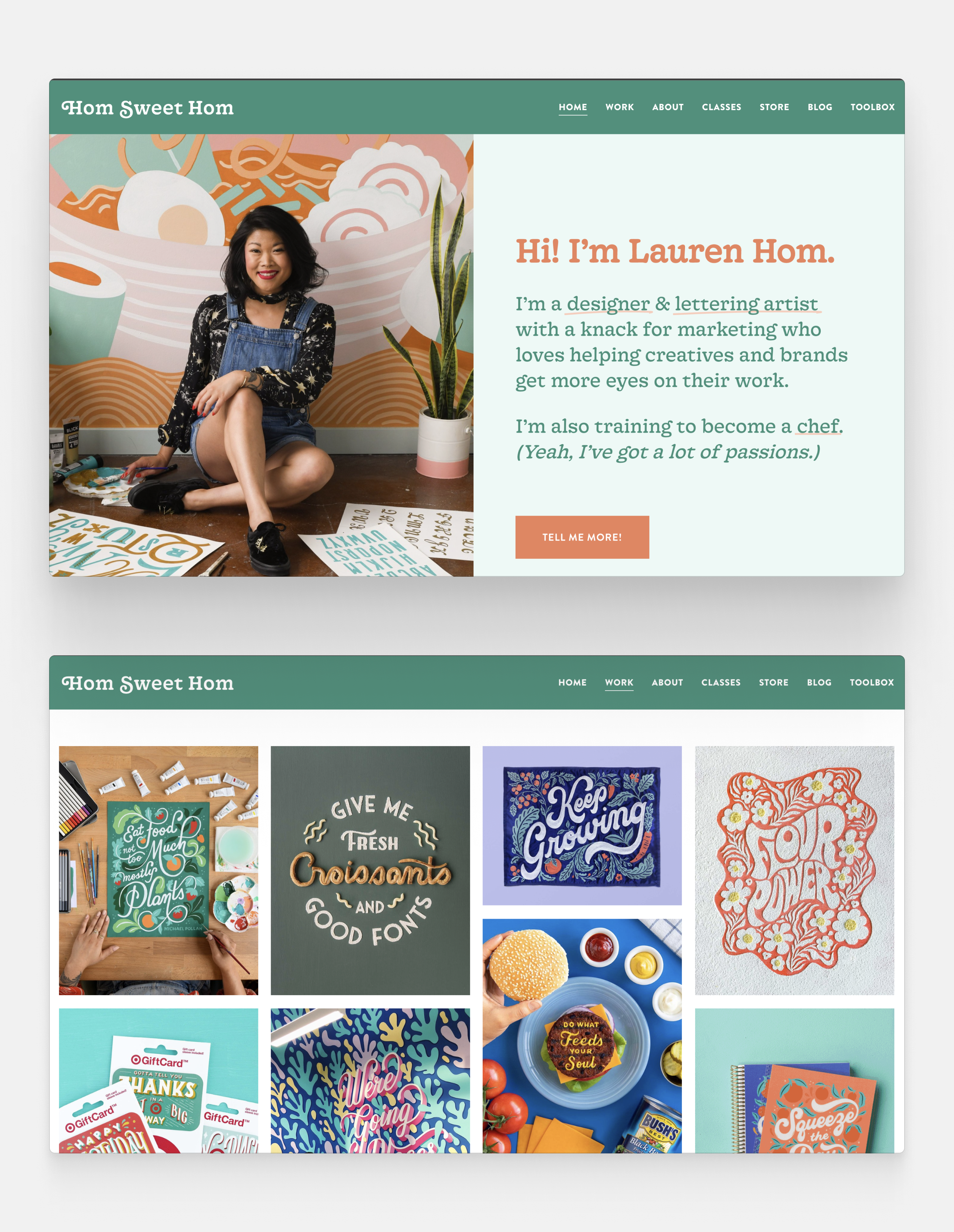
Lauren Hom is not only an expert hand lettering artist, but a marketing genius as well. She regularly shares blog posts about freelancing, motivation and career advice.
Pro tip: if you’re a senior designer, include a blog in your portfolio to become a thought leader. You can talk about your design process or advertise your services.
9. Mike Kus
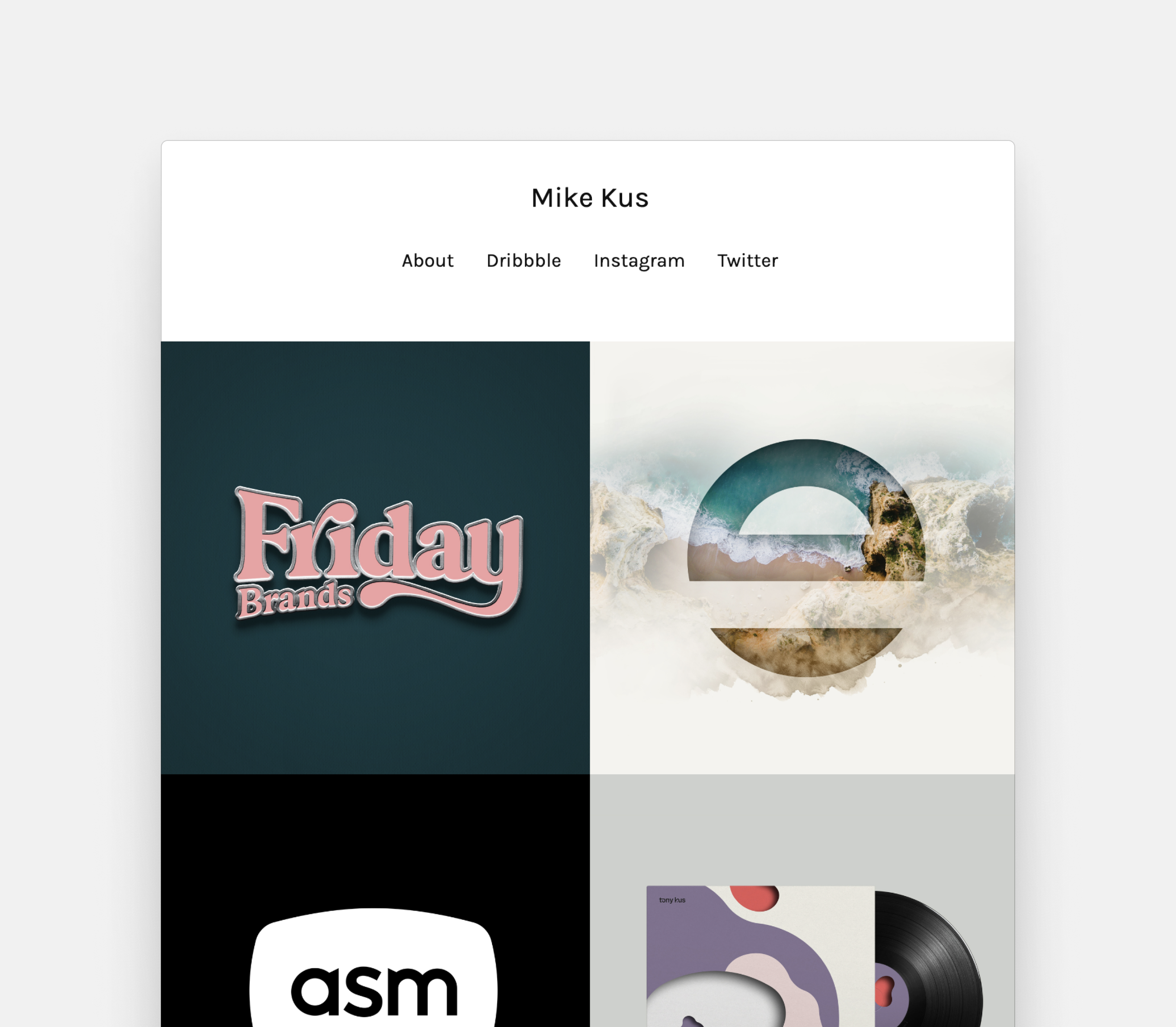
Mike’s well-designed website lets viewers interact with their design. The animations, pop-ups and zoom-ins invite you to visit every corner of his website.
Pro tip: a little UX design never hurt nobody. Fade animation is just one of the many simple tricks you can use to elevate your portfolio.
10. Mike Perry
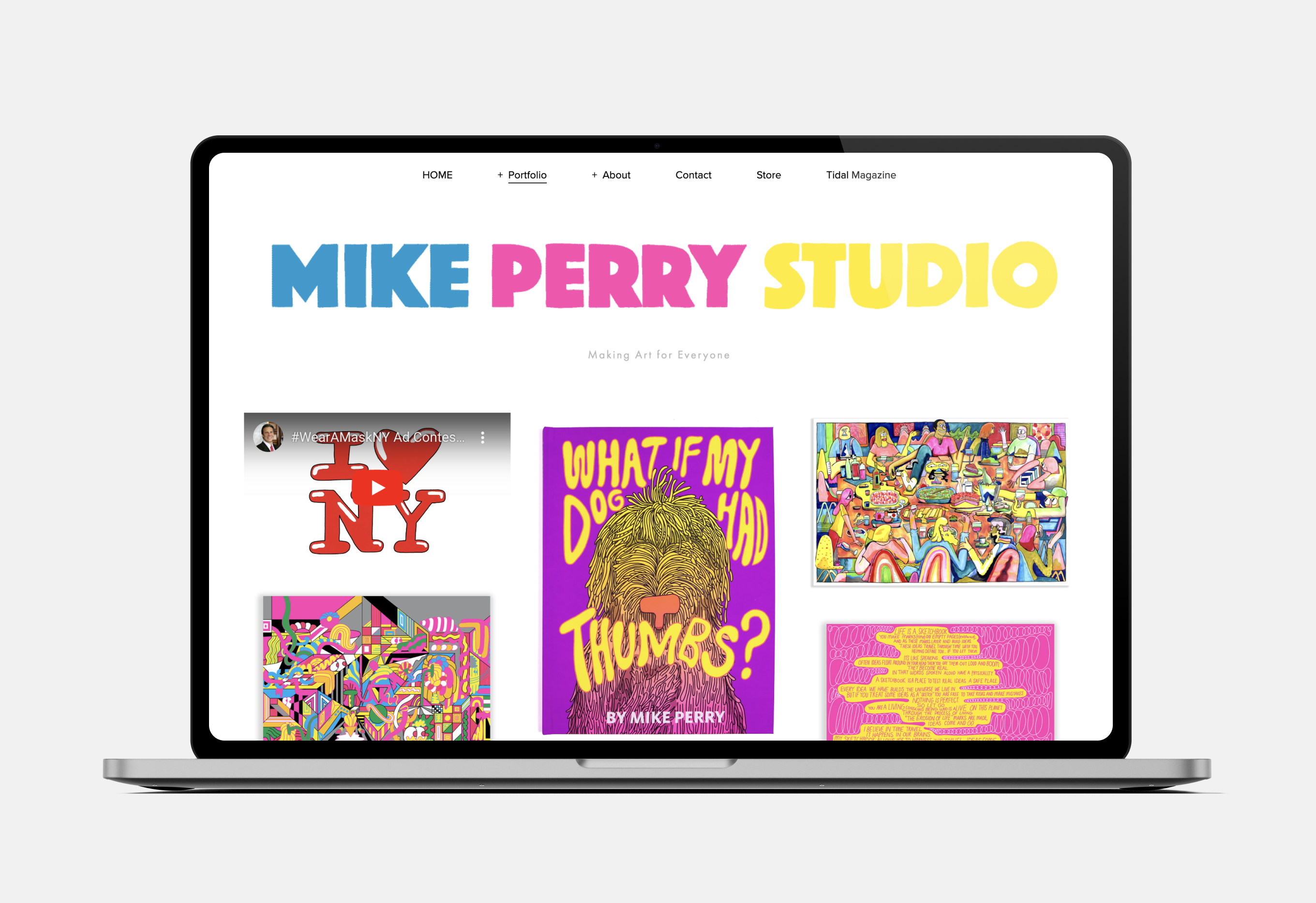
Mike’s daring designs call for a cheeky portfolio. Flashy, shiny and constantly moving, this is a website you won’t forget.
Pro tip: you need to be bold to be remembered. Unleash your creativity to stand out.

11. Tanamachi Studio
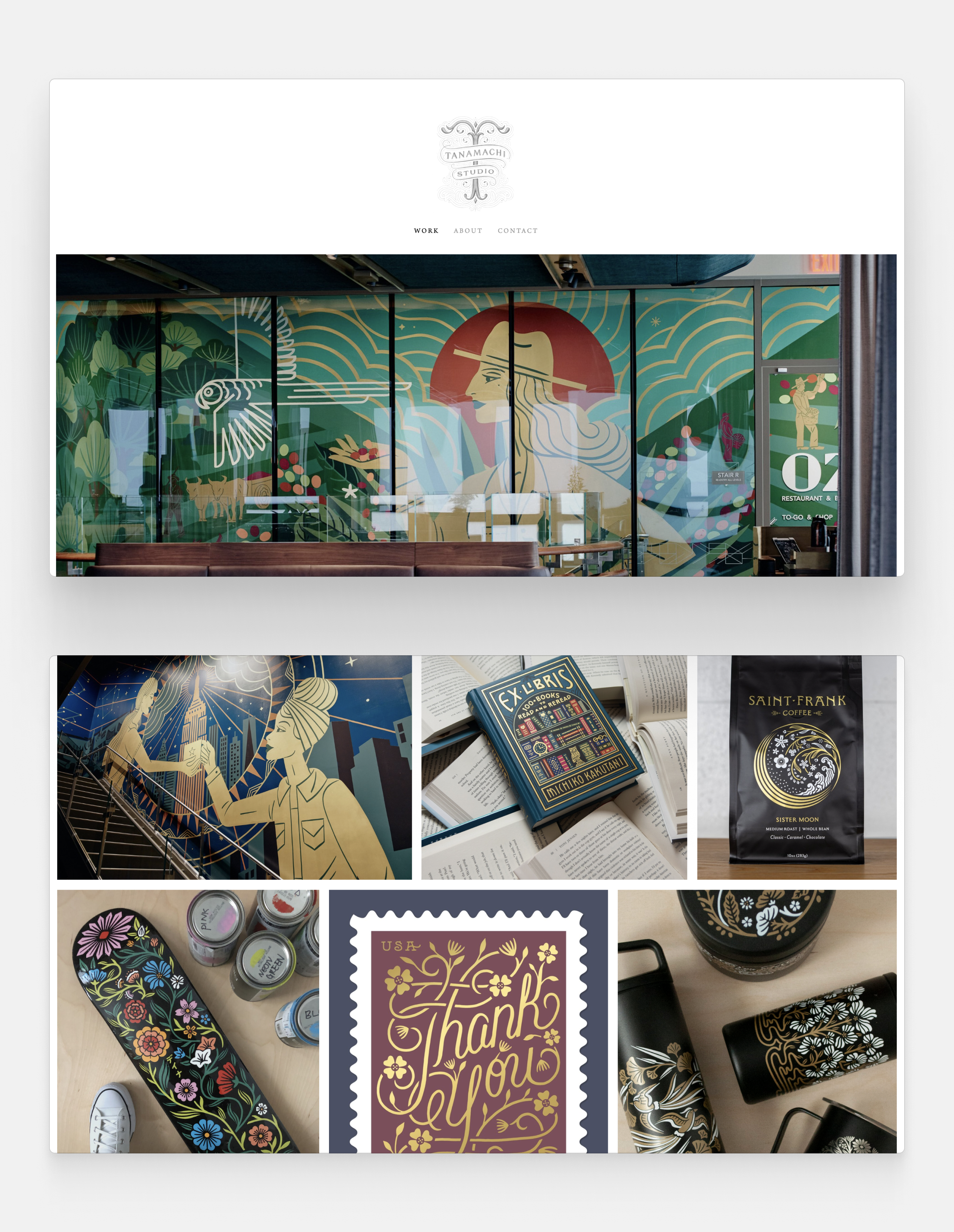
Tanamachi’s art deco inspired works are perfectly paired with an airy layout and understated design. The featured artworks include murals, packaging, ex libris stickers, stamps, and even custom made skateboard designs.
Pro tip: the first thing you see on this portfolio is the logo, which is a great way to add a personal touch.
12. Velvet Spectrum
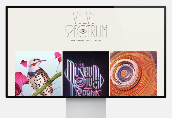
This studio specializes in 3D art. Their portfolio is an immersive experience with gifs, videos and sounds.
Pro tip: if you work with 3D designs, you need to include videos in your portfolio. To guarantee accessibility, having your own portfolio website is the best choice.
13. Anthony Burill
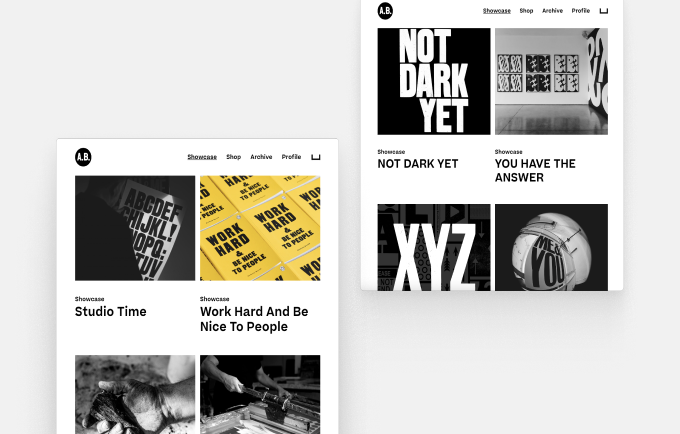
Anthony’s work is displayed in black, white and yellow. The colors perfectly evoke the quiet melancholy of his work.
Pro tip: color, or the lack of thereof is a defining feature of your portfolio. Choose the colors of your personal brand and stick to them on the landing page to make an impact.
14. Alex Trochut
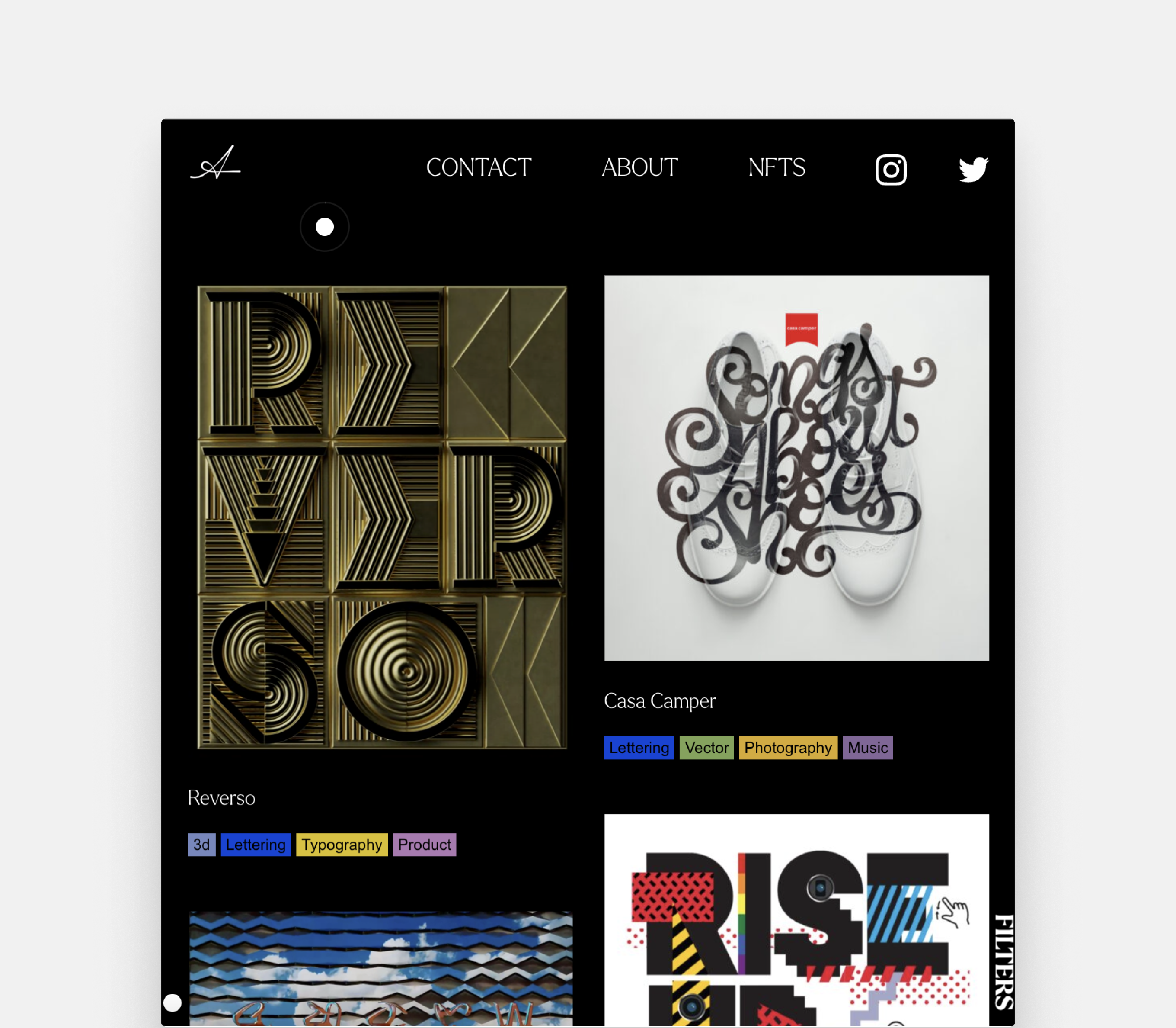
Alex’s portfolio perfectly balances chaos and order. While the website features a wide variety of work, the titles and labels always let you know what you’re looking at, and where you can find more info.
Pro tip: guide your viewers with interactive labels. It’s a simple way to let them explore the type of content they want to focus on.
15. Timothy Goodman
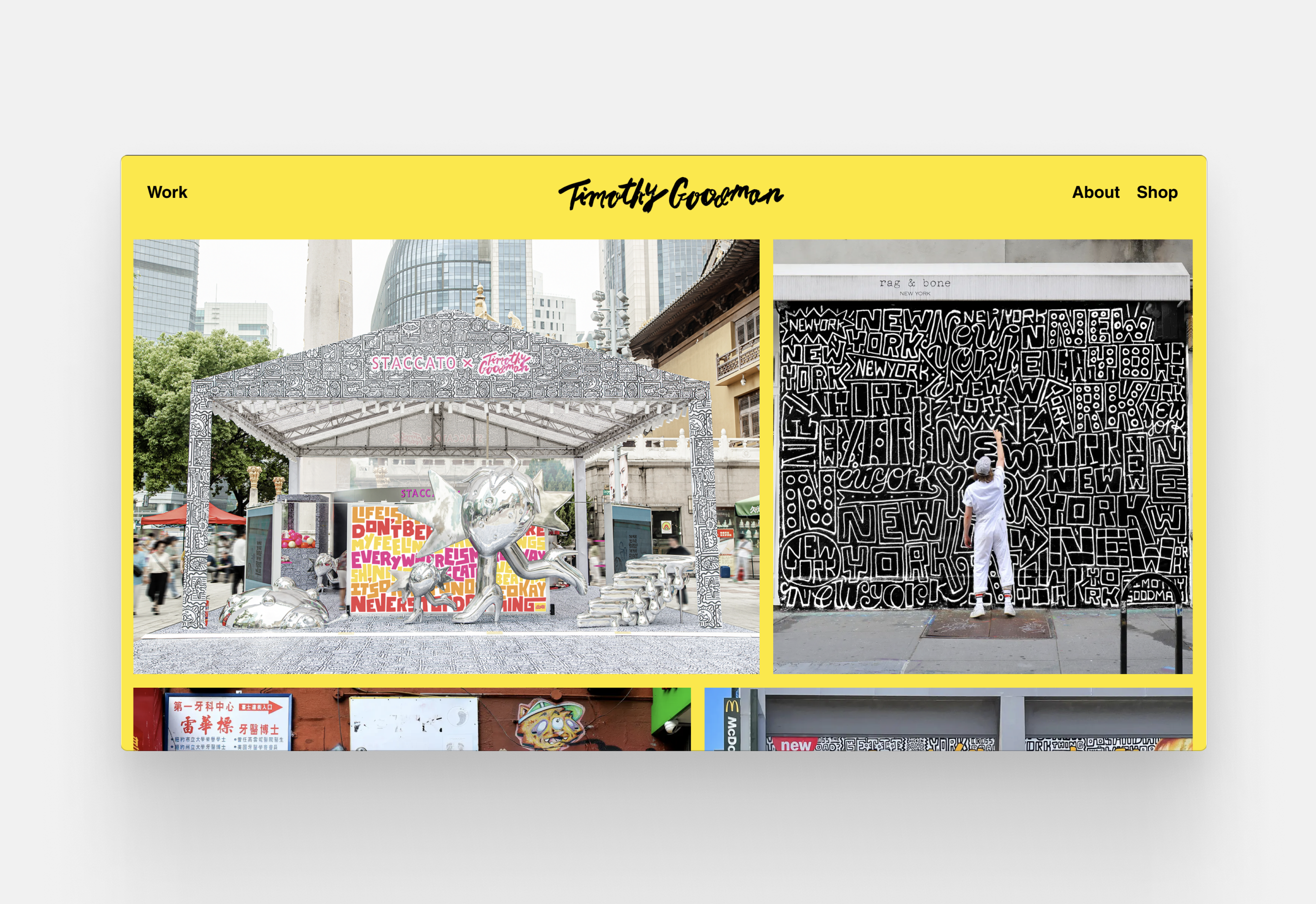
Timothy is a designer and illustrator drawn to patterns, colours and whimsical lettering. His portfolio doesn’t simply feature his designs, but photos of his designs–and of himself at work.
Pro tip: this is the simplest trick on our list–get a photo of yourself working on a design. It makes a better impression and a lasting visual impact, compared to a headshot with a white background.
16. Leta Sobierajski

Every single element of Leta’s portfolio screams delight and whimsy. She’s a trend-setter unafraid to go against convention.
Pro tip: rules are made to be broken. If deliberate chaos fits your aesthetics, a rebellious layout has a higher chance of landing you clients than a more restrained one.
17. Ive Penkova
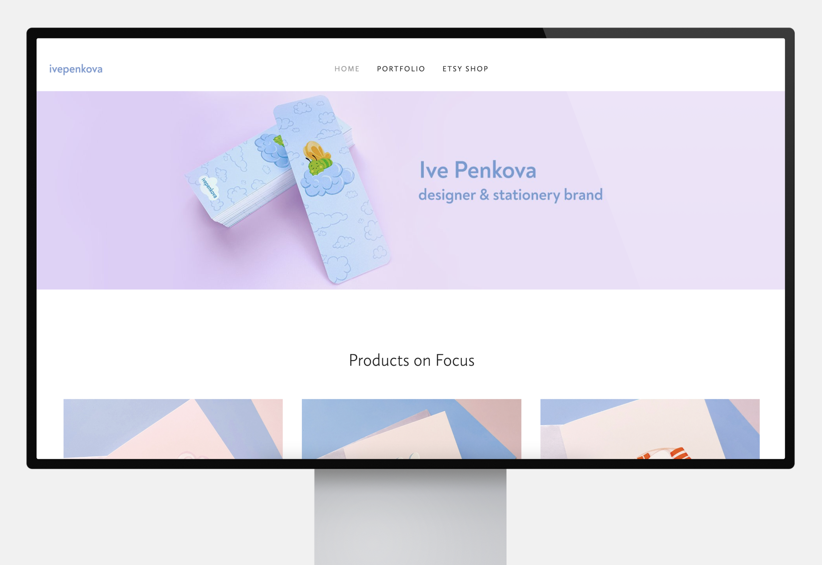
Ive’s portfolio uses soothing pastel colors which fit her soft aesthetics. The layout is similarly relaxing, with lots of space to breathe.
Pro tip: your portfolio should evoke a mood. Think about what you want your viewer to feel, from joy to excitement to curiosity, and convey that emotion through the design of your portfolio.

Graphic Design Portfolio Guide
All of the designers featured above started their portfolios from zero, like you. The following guide provides practical tips and tricks so you can create a portfolio in a blink.
Let’s start with the basics.
What is the Best Way to Organize my Graphic Design Portfolio?
Portfolios follow a standard format, which typically consist of four pages.
1. Home page
The home page is the heart of your portfolio. This is where you include your work and projects.
Some designers create a landing page that focuses on navigation besides a picture spread. This is an effective way to utilize the website format and make sure that your viewers can find everything.
2. About me page
The about me page is the place for your graphic design resume, but it allows you to be less formal. Talk about your professional background, from your education to your relevant work experience. Mention the techniques and software you prefer and the type of graphic design you do:
- Advertising and marketing design
- Brand design
- Logo design
- Packaging design
- Web design
- UI design
- Print and publication design
- Typeface design and lettering
- Illustration
- Game design
- Environmental design
- Motion design
3. Contact page
Your contact information should be all over your portfolio, from CTA-buttons to footers. Still, a dedicated page is the fastest way your viewers can find where to reach you. Besides a professional email address, you should include social media platforms where you display your work.
4. Services
If you do freelance work, this page is paramount. You may be a jack of all trades, but it’s important not to overwhelm your viewer. Select which services you want to highlight, and mention additional types of designs you can create.
Your service page’s goal is to get the viewer to contact you. You can always talk about details later.
Don’t forget to repeat your email address and include some additional design examples from your portfolio.
What Should be Included in a Graphic Design Portfolio?
The type of work you should display depends on your level of experience.
Student Portfolio
1. Sketches and complete designs
Remember: drawing is not design, and nor is Photoshop. Illustrator portfolios have different requirements. When applying to a graphic design course, your typography skills are more important than watercolors or your ability to use the lasso tool.
Include sketches that show your design process, then focus on completed designs. Unless otherwise specified, you can create anything you’re passionate about, from merch for your favourite brand to re-designs of a cherished book’s cover.
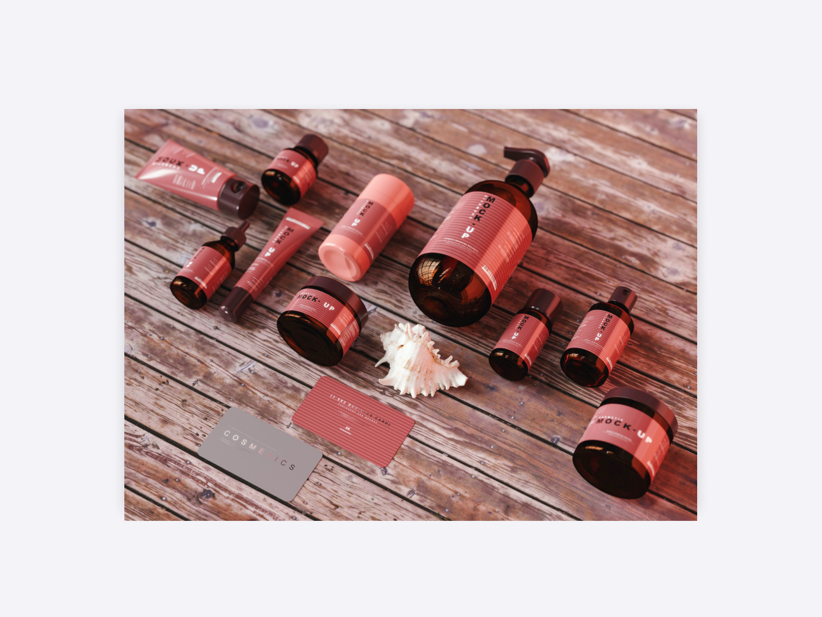
2. Mockups
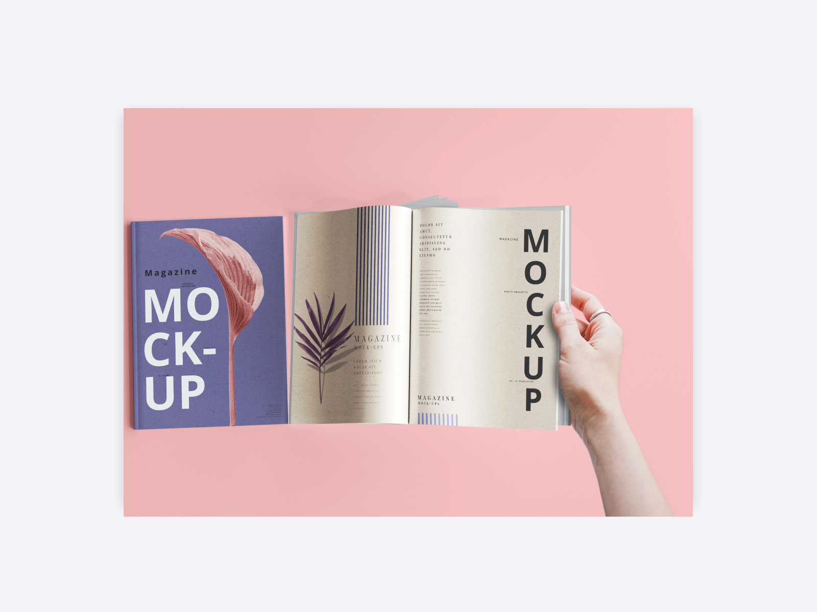
Mockups are an effective way to see how your designs would exist in the real world. You can use instant mockup generators like Mr. Mockup, or create your own with your favored design tool.
3. Examples of digital and traditional techniques
Show the versatility of your skills by mixing digital and traditional techniques. You’ll need both for your studies. If you’re hopeless with a pencil or never held a tablet, don’t fret: think about how you can re-interpret what you’re already good at in a different format. Create new, unique pieces for your portfolio instead of frantically searching through your sketchbook.
Beginner Portfolio
1. Polished designs
Easier said than done, right? Don’t despair: here’s a few tricks.
- Recycle your student work. The more recent, the better. You may want to patch them up or redesign them, but at least you’ve got a starting point.
- Create designs for nonexistent brands. Remember: the point is not to trick your client. Make sure your viewer knows that they’re not looking at examples of actual client work. Say so in the description and use fanciful names.
- Embrace social media. Browse a social media holiday calendar and create designs for hashtags that inspire you, be it a campaign for recycling or international space day.
- Participate in design challenges and competitions. You don’t need to win: showing up is evidence of your dedication to your art.
- Volunteer. Seek out local non-profits, do contract work or gigs to get some experience that you can include in your portfolio.
Remember to favor quality over quantity, and curate a selection of your best work.
2. Professional bio
An about me page is always necessary, but it’s especially useful for beginners. Include the following information:
- Education and experience, even if you feel like it’s nothing to brag about.
- Goals and aspirations. What kind of work do you want to create? Think about this section as a summary of your graphic design cover letter.
- Mission statement. What’s your work all about? What values would you like to bring to a company or agency?
- Personal magic. You’re an artist. Wear your heart on your sleeve and share the things you love the most, from your design icons to your inspiration.
3. Statistics and results
Celebrate your results in the description of your projects.
- Statistics. If a piece garnered a lot of love online, make sure to mention it.
- Awards. Any sort of official recognition is a badge of honor.
- Client work. Landing a client as a beginner is very impressive, so you should definitely highlight this experience.
Medior and Senior Portfolio
1. Recent design work
You’ll be expected to keep your portfolio constantly updated, so make sure to highlight your newest designs. Always add a project brief: when was the design created, and for what purpose?
Feature projects that you’re not only proud of, but which represent the type of work you’re looking to do.
2. Testimonials and case studies
- Testimonials: think ahead and get feedback as soon as the project is delivered. A happy client will be glad to help you out with a punchy blurb you can use in your portfolio.
- Case studies: include case studies in your portfolio to give your client a better understanding of what is it like to work with you. Case studies allow you to show your process in-depth.
3. Webshop
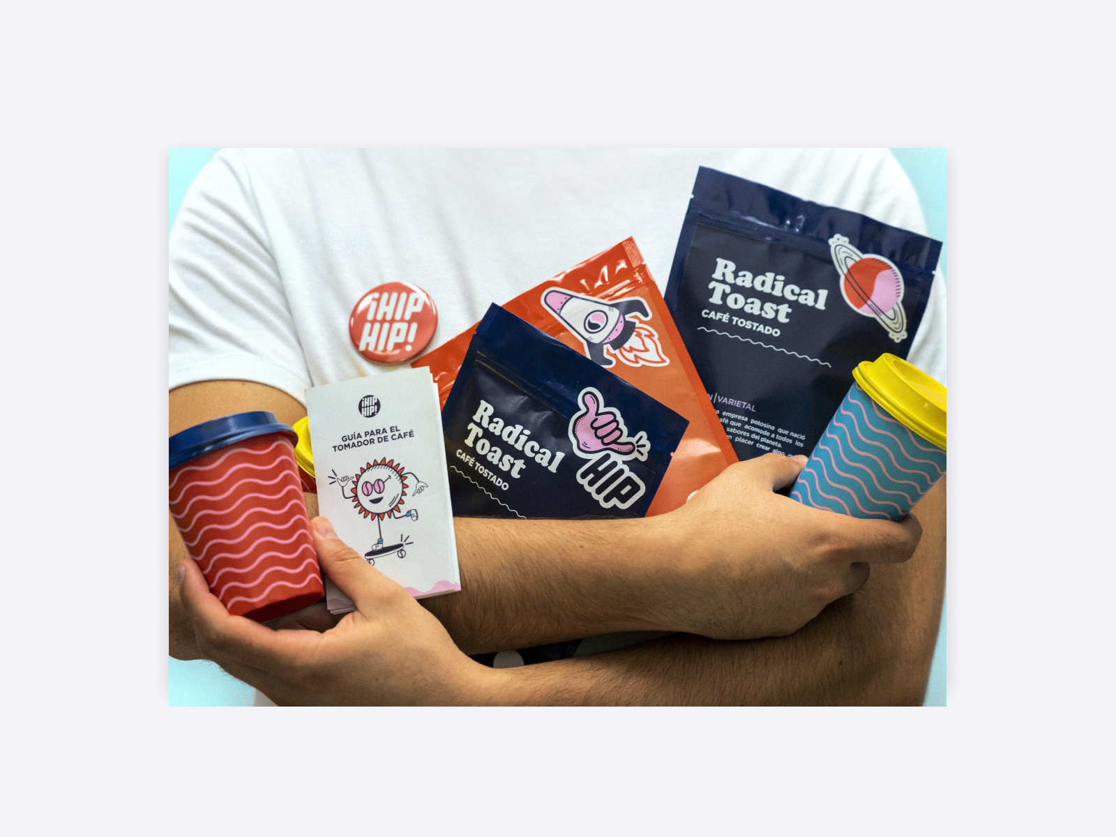
Selling prints and merch is a great opportunity for some extra income. Including your webshop on your portfolio might not just win you some new buyers, but it’ll show employers the marketability of your products.
4. Services
If you do any sort of contract or freelance work, your portfolio is the perfect place to advertise it. The type of services you should list include:
- Graphic design services, from brand identities to logo design and video game UIs. Make sure your client has a clear understanding of your exact field of expertise.
- Designer training from webinars to in-person classes. An eager student browsing your portfolio for inspiration certainly wants to know where they can learn more from you.
- Workshops are more popular than ever with remote work getting standardized. Seek opportunities to spread your knowledge.
5. Blog
Should you have a knack for copy, don’t let it go to waste. Share your insight and experiences to gain authority in your field. Consider the following graphic design blog topics to write about:
- How-to guides for juniors
- Graphic design career tips
- Resource recommendations
- SEO blog posts to boost your services
- Your biggest lessons and most exciting challenges
- Graphic design trends to embrace or avoid
+ Bonus tip
Learn what differentiates an art director portfolio and a graphic design portfolio. If you have experience in art direction, make sure to highlight it.

What Format Should I Use for My Graphic Design Portfolio?
Portfolios come in many shapes and sizes. Let’s review the pros and cons for each.
1. Website
Pro: a portfolio website is the best option if you’re looking to get hired or find new clients. A website is easy to update, curate and organise. You can include direct calls to action, so emailing you or purchasing a product is only a few clicks. What’s more, the quality of your work will never be compromised. Mobile optimization guarantees that you can pull up your portfolio anytime, anywhere. Portfolio builders such as Folioeditor let you build a website in a matter of minutes. You can even use white-label Wordpress websites.
Contra: having a website can be costly. It’s worth the investment, but if you have doubts, start with the free trial version to see if it’s a good fit.
2. Social media
Pro: dedicating a social media platform to your design work allows you to be part of a vibrant community. Exposure is easy, as you can purchase ads or hop on hashtags.
Contra: it’s very difficult to stand out on social media. You’re right amidst your competition. Unless you’re constantly producing viral content, mediocre statistics will reflect badly on your work.
While social media is popular, it’s not considered professional, so your portfolio has a higher chance to be rejected. One reason for this is that the image quality is lackluster.
3. Art platforms
Pro: art platforms like Behance, Art Station or Deviant Art let you upload full-sized images and a complete portfolio. Many of them offer beautiful layouts, or great ways to easily organize your work. Connecting to your fellow designers is easy.
Contra: just like on social media platforms, your competition is merely a click away. There’ll always be someone with a flashier portfolio and more experience. The lack of customizability on some of these platforms means it’s impossible to stand out. Your options are limited and you have less freedom than with your own website.

4. PDF and slides
Pro: PDF portfolios or slideshows are easy to attach to emails. You can reach them in the cloud, and may even print them if necessary.
Contra: these kinds of portfolios are harder to edit than a website. You may lose track of which version is the newest, or risk losing the file entirely.
The image quality is compromised, and the file sizes are often massive. If you are required to send your portfolio as an attachment, it’s better to transport your website to a PDF and compress it.
5. Portfolio book
Pro: some places will require you to hand in your portfolio in a hard copy, and there’s no way around it. It can be especially relevant if you work in print design. You may find this video useful.
Contra: even if paper portfolios are required for your particular niche, it’s vital to have an online presence. A portfolio website is the most professional choice.

How Can I Make my Graphic Design Portfolio Stand Out?
Hiring managers see hundreds of portfolios, and clients are looking for the best. Here’s how to make a portfolio that doesn’t just get you noticed, but remembered.
Vision
Don’t settle on merely creating a collage of your best work. Apply your skills of art direction and strive for a unified vision. Each piece should come together in a harmonious design, from your layout to the typeface and color scheme of the works displayed.
Storytelling
The best way to communicate your vision is through storytelling. As a creative, you have a talent for evoking emotions. Think about what you want your portfolio to be about, and how to convey the mood you want to achieve through design.
Execution
The devil is in the details. Your portfolio needs to look polished, even if you set out to break the rules. Make sure that the copy has no typos and that every pixel is in the right place.
Marketing
Create some clout for your portfolio on social media. Include a link to it in your email signature and on your business card. Make sure people know where to find you.
How Often Should I Update my Graphic Design Portfolio?
Your graphic design portfolio needs to be updated constantly, so it reflects your evolving skills. There are several ways to go about it.
- Add and delete. Whenever you have a new piece you’re proud of, add it to your portfolio and delete an old piece that you no longer consider your best work.
- Schedule updates. Dedicate a day each month to reviewing your portfolio and see if you’re still happy with it.
- Rise to the occasion. Whenever a new opportunity comes, adjust your portfolio to maximise your chances. Think about what your viewer wants to see, and highlight it to the best of your abilities.
The easiest way to keep your portfolio up to date is to use a dedicated portfolio builder like Folioeditor. Subscribe to our newsletter and be the first to test it.
